What we can learn from the Louvre about hanging pictures in our home
A blueprint for hanging a gallery wall in our home by Sabrina Shortland
“What we put on the walls tells us something of who we are, how we love and who we hope to be.”
You know you know when something doesn’t look right, but you don’t know why?
That’s me (Jo Tennant - founder of 20 Photos) when I’m hanging prints in my home. I faff around for days, like I’m blindfolded and stumbling, tweaking here and there in the hope that I’ll fumble the layout onto the ‘right’ path’.
Some people just seem to have the knack for making things look good across the design worlds. But the truth is there are learned structures that they use.
I know I want a wall of personal memories, but I lack the confidence (and framework!) to bring it together. If that’s you too, our wait is over!
Sabrina Shortland, an interior designer, has written this thoughtful but practical framework, grounded in history, for us to follow.
I could not be more delighted to hand over to Sabrina with her advice.
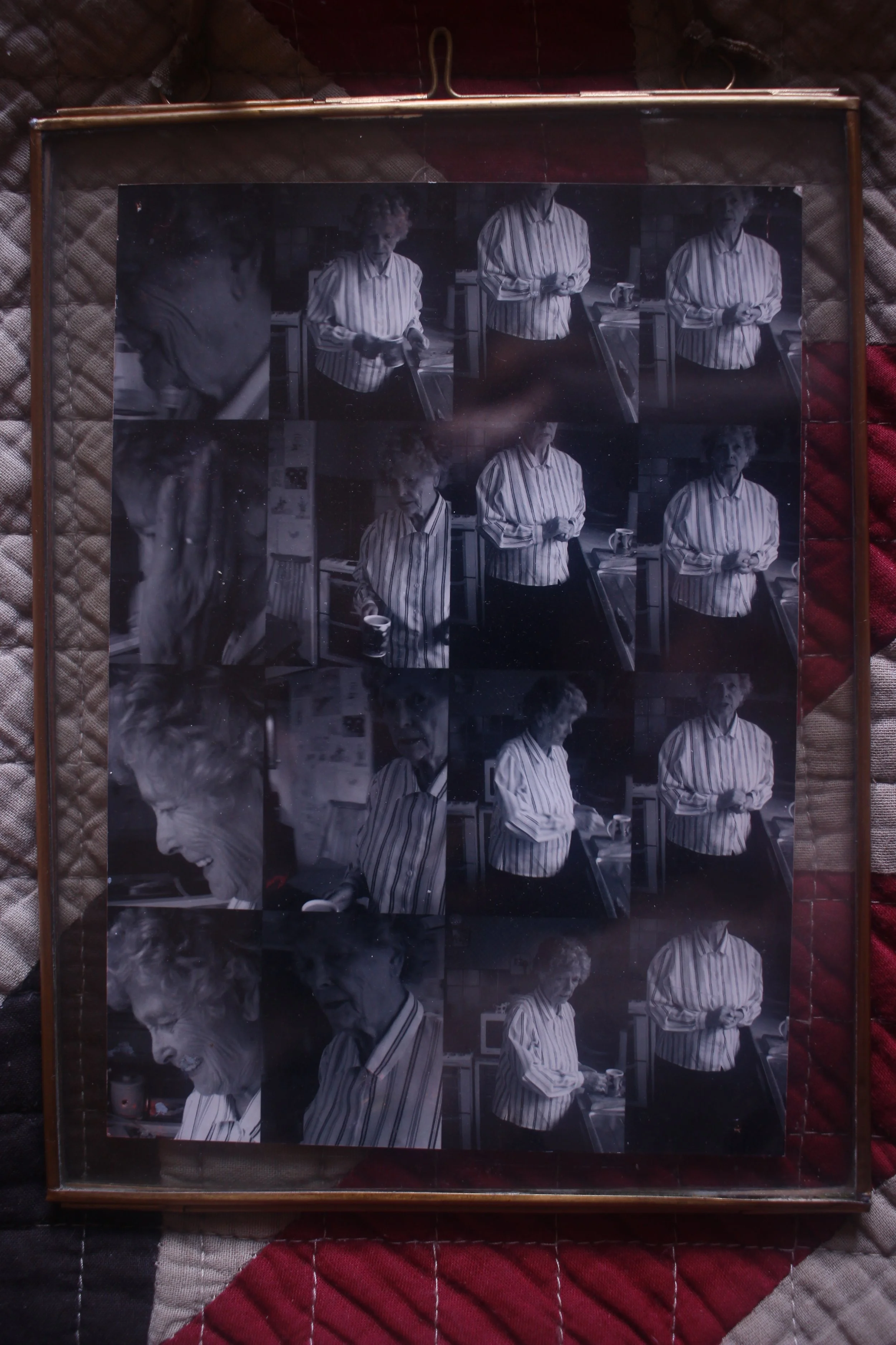
As I write my first draft of this for Jo, I’m sitting looking at a precious, blurry photo. It’s a grid of black and white images of my Granny making Yorkshire puds in the bungalow she built brick by brick with my Grandad in the 60s.
She’s moving round the kitchen doing her best to avoid the lens, batting us away as she reaches for the fork to whisk the eggs. My sister is behind the camera. We’re teenagers in the unseen side of this moment and thick as thieves. I feel a glorious kind of longing for a time that feels simpler, softer and oh so full of roast potatoes on a Sunday.
It won’t surprise you then that I know the value of living with the ever evolving story of our lives at home; it’s a big factor in my work. What we put on the walls tells us something of who we are, how we love and who we hope to be.
Could I commit to 20, meaningful images from my crammed camera roll though? Could I hell!
I believe I’m so indiscriminately over-attached to all 3000 of them. I need help (and more storage!).
Thankfully 20 Photos speaks to this exact issue and Jo is here to discriminate for us with her patient, expert eye.
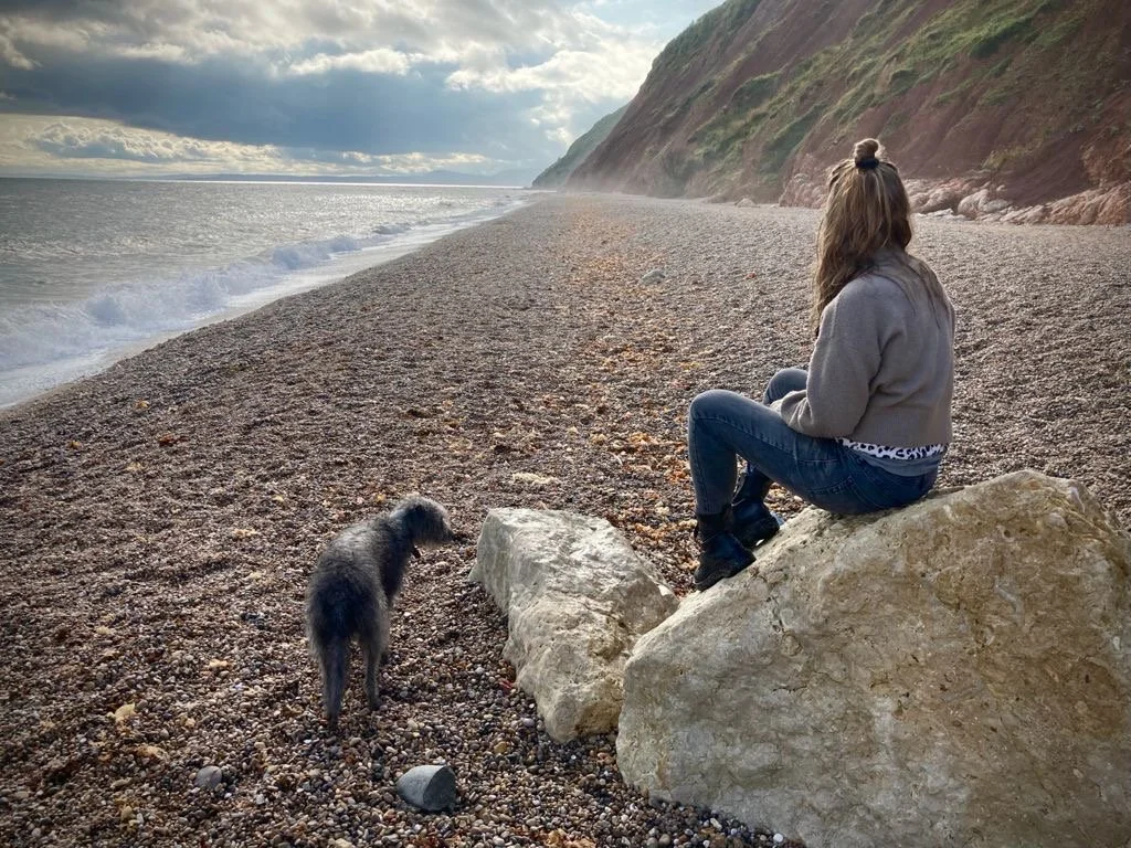
Sabrina, on the beach with her dog, Badger
Once you have 20 treasured moments to have about you at home you might like some simple, impactful tips for how to hang them.
A blueprint for a successful gallery wall
“The truth of the matter is that the gallery wall is no trend but an enduring feature of European culture”
It’s something I enjoy doing for clients and a timeless way of presenting a mix of images you love at home.
A couple of years back you couldn’t move for Pinterest images of stairways adorned with art, prints and photos and some people felt a bit over it but the truth of the matter is that the gallery wall is no trend but an enduring feature of European culture.
I present to you The Salon room at the Louvre:
Exposition au Salon de 1787, etching by Pietro Antonio Martini published in "Aux armes et aux Arts" by Adam Biro, 1988.
So, if you’d like your own slice of French fancy at home here are my top tips:
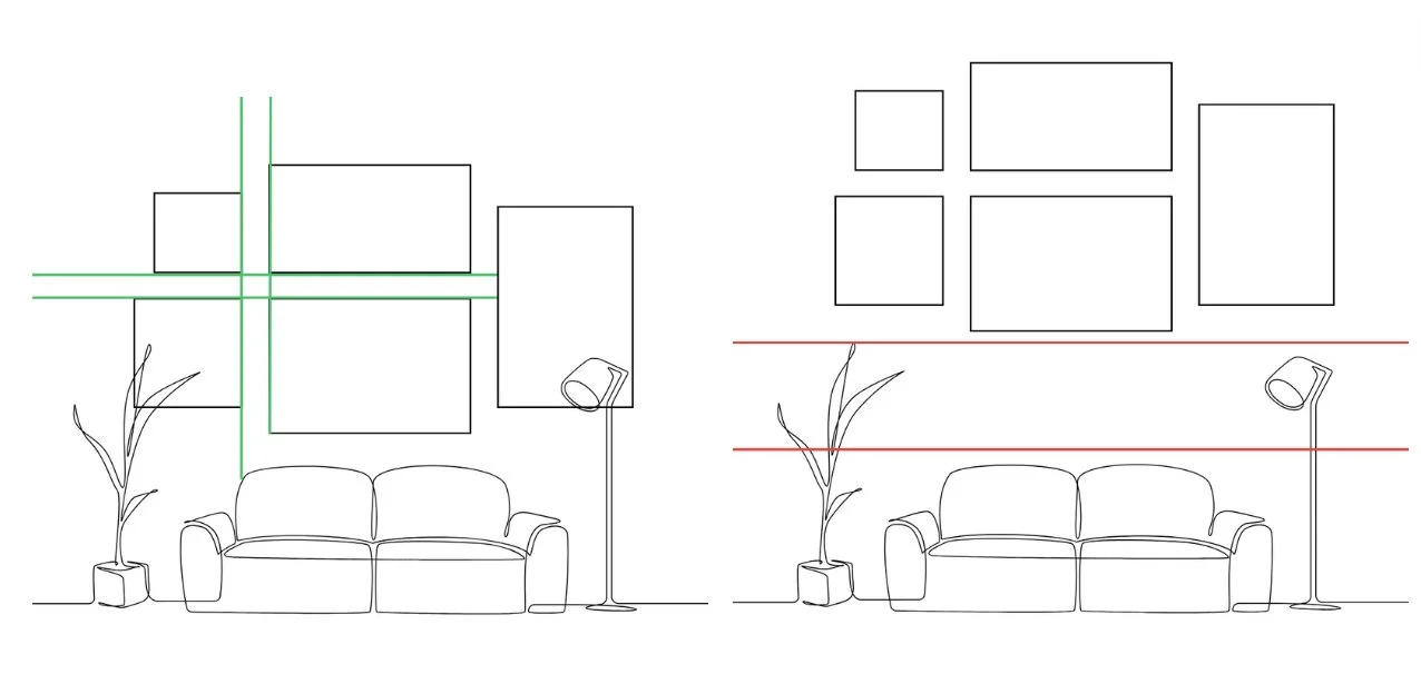
1/ Choose an odd number of images. A mix of sizes and orientation is a good thing, too
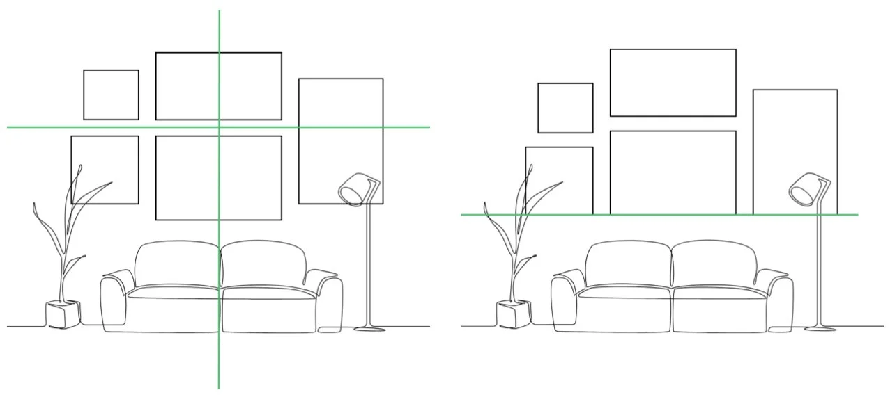
2/ Have a look at the rest of the room: is there a key piece of furniture that will anchor the middle of the hang and dictate where your first image will go? If not, find the central point of the wall
3/ Lay your images on a bed or on the floor so you can play with different layouts before committing
4/ If you’re a planner, cut down some sheets of newspaper to the size of your frames so you can tack them on the wall before any hammers are involved
5/ It’s helpful to have a bit of order so arrange them around a midline or bottom line to help create balance and keep the biggest, ‘heaviest’ image towards the bottom of your composition (small images were kept at the bottom for viewing in the Louvre but let’s forget that for now…)
6/ A single large portrait frame can be balanced out by two smaller ones- see the left and right sides of my graphic and I tend to like bigger landscape images in the middle
7/ If colour is present in your images think about how that runs across the wall as you might like to use this as a theme
8/ Likewise, look for dialogue between images. I enjoy an image that is facing left to be hung on the right hand side and vice versa.
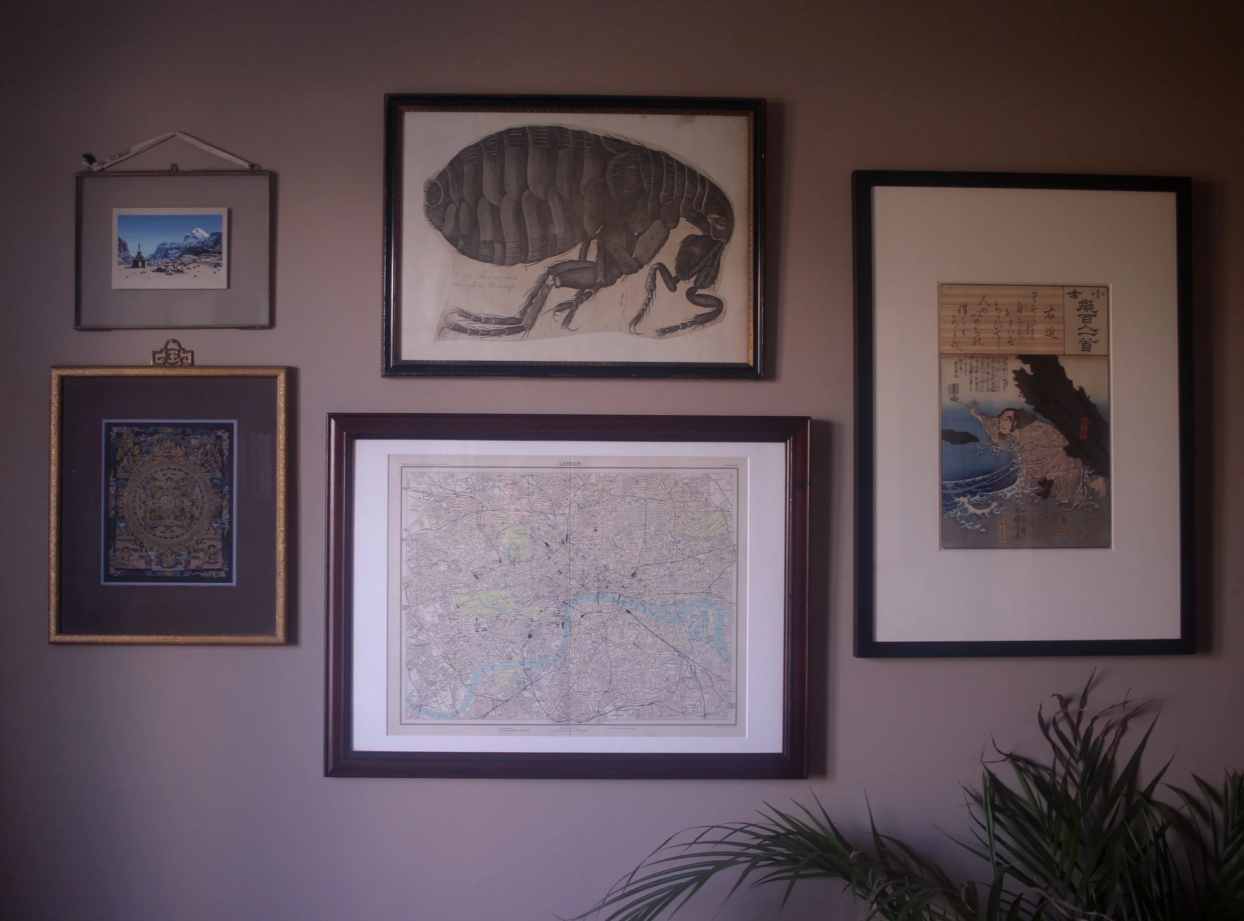
Blue is a gentle theme amongst this collection and there’s something nice about the inward reaching arm of the legend in the Kuniyoshi print
9/ Think about the spacing between images along both the vertical and horizontal gaps. Keeping this uniform helps tie things together
10/ Avoid hanging too high above a key piece of furniture like a sofa or else the whole thing starts to float and you’ll be left with some negative space
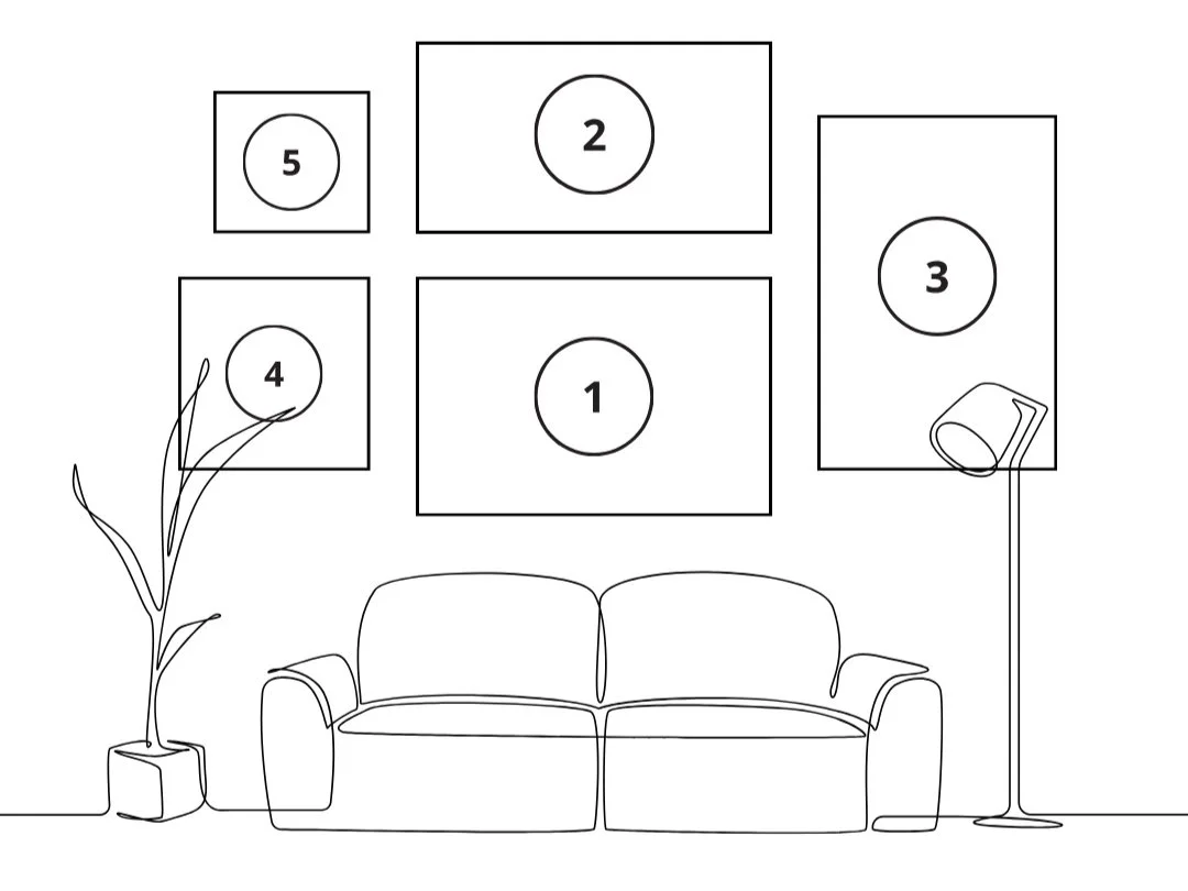
More is more with a gallery wall so if you’ve got into the swing of things then trust your gut and continue to hang around your central collection of images. Here’s the order I’d hang these on the wall and why:
Number 1 would go first as the biggest, landscape image and I’d centralise it to the sofa.
2 would be next and I’d set my spacing between them (‘that looks about right’ is completely fine for this by the way).
Notice how number 3 is well spaced and marries 1&2 together?
Next up would be 4, lining it up with the top of 1 and
finally, as the smallest, 5, keeping my spacing in mind and using the bottom of 2 as a reference point.
Happy hanging!
Sabrina
PS- If you enjoyed this and you’d like to read more of my work in the world of interiors, creating beautiful homes for busy people then do join me on my newsletter, The ShortHall. Sign up via the link in my insta bio over on @shortlandhallinteriors. We’re a thoughtful bunch and you’d be very welcome.

